Lighting as Brand Identity
Pall Mall Club Singapore
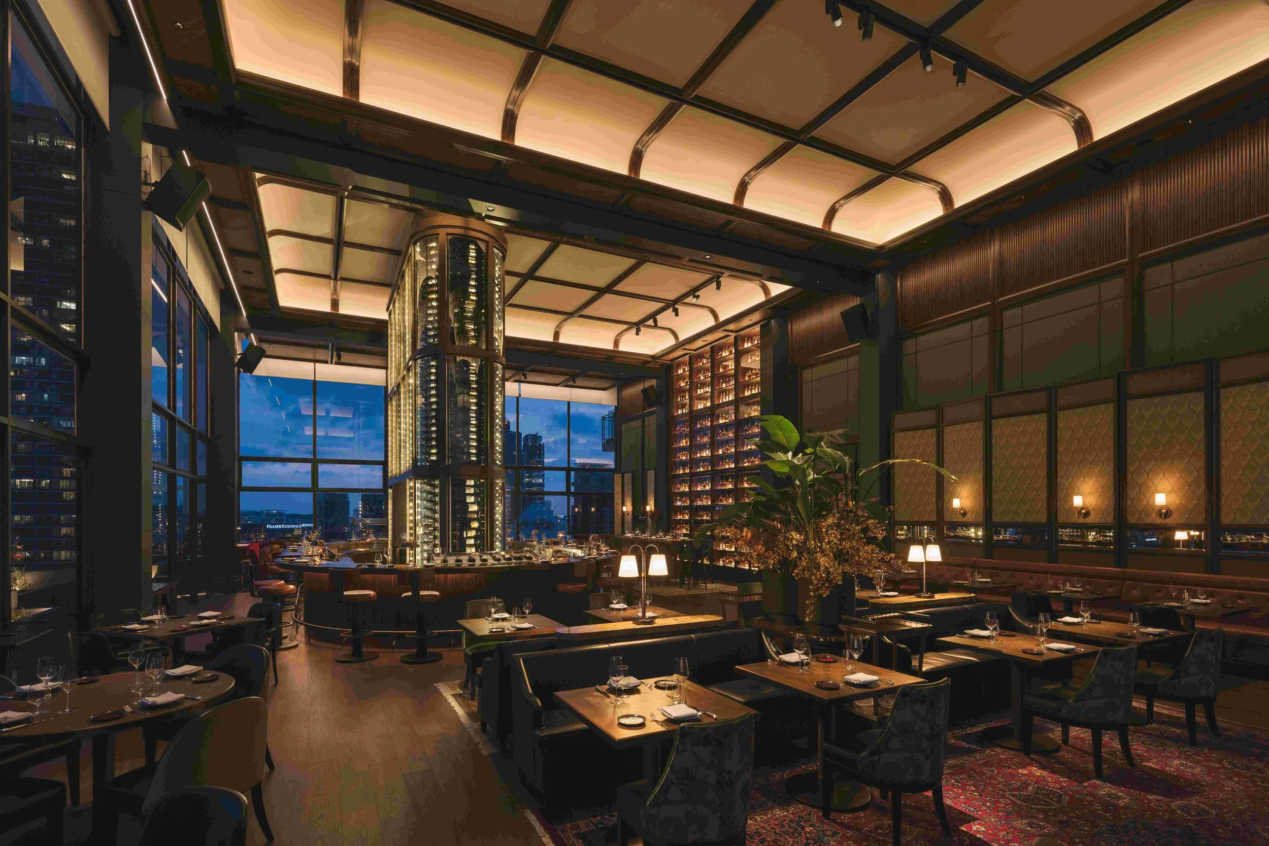
As I am writing this blog I am still in Europe, more precisely in Bordeaux, known for its famous wines. Not surprisingly I am working on a project that has a wine tower as its signature feature. Following the first venue created in London and subsequently in Singapore, the third “instalment” will be in Bordeaux and yes again, it will have a wine tower as its signature. The towers are 6-8m high and can be accessed from the inside to retrieve the selected wines.
Each tower has slightly different design features as its design execution is still site dependent, but generally the lighting challenge is the same; create a feature tower that validates the wines on display. The wine towers are temperature and humidity controlled and the lighting is warm white of high CRI quality. The whole enclosure is UV filtered to preserve the wines that are of some sought after vintages.
While the technical aspects can be easily managed it is the implementation, specifically the location and installation details that requires the most creative inputs as basically we don’t want to see the lights, not from the public view on the outside, not from the inside. It has to have just the right balance in terms of brightness as to allow for the visual impact as well as for the sommelier to easily find his or her way in identifying the right wine label that was ordered.
As we are working on the next venue instalments, I am reflecting on whether there is actually a design methodology that can develop as a “design manual” that will allow us to implement the lighting designs for each new venue so that is becomes a signature feature.
I think we have “cracked” the code, learning along from the first ones, but I am curious to know from our lighting community if anyone has had any experience in designing signature lighting that has become the recognisable feature of the venue, it’s corporate brand identity, regardless, whether it is located in London, Singapore or other cities around the world.

